Noma Bar: Playing with Negative space & Thinking with typographic


Noma Bar was trained as a typographer. He would say his work is visual communication, and that is not exactly graphic design and not exactly illustration. He has a typographic background, and he has a good sense of using 'space.'
noma-bar/portfolios

Revision of a few Compositions

After seeing some work from class, and what things to be aware of when making compositions, i redid a few of mine. I re-drew the grids, its still challenging aligning with a grid! But it seemed to work and fall together more easily when there was a stable grid to work from. So here are the links to the pdfs of my comps. 


Cool video

here is a cool example of typographic elements used to reinforce a speech.
It's also quite funny and true.

ps: I couldn't figure out how to post the direct link to youtube so I guess you'll have to copy and paste the old way.

http://www.youtube.com/watch?v=V9x5KhfWAis

HTML Tatoo


Where is footer?

Drawing_grid_text


Posters of Kiss and the Ellipsugh(Anne)

This is Pretty ****ing True

I know it's a little much and the over-use of the word gets old but it's so true and maybe even a little inspiring.

-Zoe Katleman

Source: goodfuckingdesignadvice.com

Homework: 9 compositions

I uploaded my homework onto a pdf so here are the links:


Part 1: Comps

Part 2: Comps

Typography and Tattoos

Lately I've been considering a tattoo and what inspired me to think of ideas are language and the meanings they convey. Tattoos are their own expressive art forms, and to imagine how elements from typography are included in the art of tattoos is interesting and amazing. I was looking on printmag.com and saw one of their previous cover issues referenced typography and tattoos, and then i started searching and found some stuff online, i dont know if they are all real but its cool to look at anyway.


And also i found this book which seems pretty interesting, here is the link on amazon :BODY TYPE

Homework, Notes 10/19/10

Hi all- sorry this is late getting posted!

First, don't forget on Tuesday there is a test on everything we've covered up until now. This includes:
- type anatomy terms
- typeface classification/history
- grid terms

Your assignment this week is to create nine type compositions:

1. Choose your 3 favorite/most successful composition drawings and scan them. Scale and crop them to fit an 8.5 x 11 page, and bring them into Photoshop, Illustrator or InDesign:

2. Over each of the three drawings create a series of linear/circular guides- in essence a unique grid- by tracing over the strongest elements and directions of movement in your drawing:

3. Use this unique grid to help guide in laying out a series of typographic compositions, each with ALL ten (10) drawing descriptions as type elements. In teach composition emphasize one of the descriptions: the one of the drawing this grid is based on. CREATE THREE UNIQUE COMPOSITIONS FOR EACH DRAWING'S GRID, for a total of nine compositions.

4. Save each of the nine compositions as either JPG or PDF, WITHOUT THE GRID SHOWING (i.e. just type). You may present them either on your laptop or on the projector in class.

Polish Posters

Just came across this as I was doing research for another class. Here are some great posters from a Vintage Polish Gallery. Lots of good "cropping" happening here :)

Very Cool "kern" Rings


If your looking for some jewelry to help express your love of typography here is a suggestion. Actually, these "kern" rings from Etsy are sold out so this is just something interesting to look at.
-Zoe Katleman

Source:Etsy.com

typorganism


It's been a long time, but it is cool though.

 Can weigh basic characters' weight!

Offers us to change an image to the ASCII code's image if you unload your picture.


Extra stuff,, a visual composer is provided as well.


 Have fun :)

http://www.typorganism.com/

Moleskin Creativity

There's this website called imprint.com which is a cool resource for artists. I came across this article on moleskins and some people who have shared their moleskins to display for the company's traveling exhibition. Check it out Moleskins


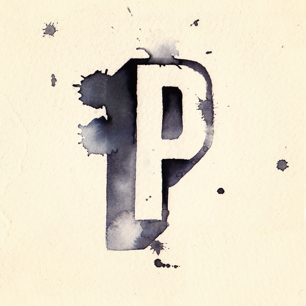
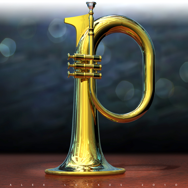
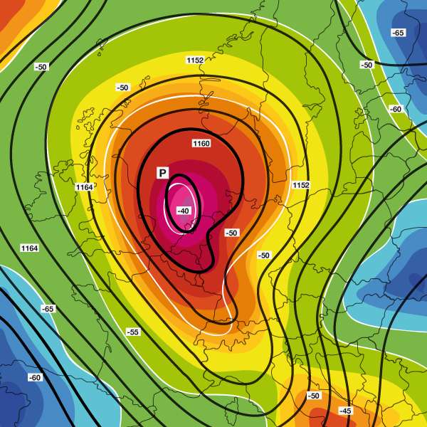
Letter Cult: ALPHA BATTLE LETTER P!

Hey guys, check this out! It's a competition called Alpha Battle and the best graphic design of the letter P wins. To view all the entries, follow the link, but I've posted my 3 favorite. Enjoy!

http://www.lettercult.com/archives/2204


Another Way To Look At Grid Systems

Here's another way to use the grid system:
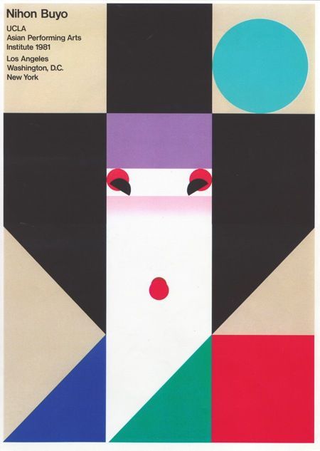
Ikko Tanaka Nihon Buyo Poster


This blog has alot of great examples of both grid systems and typography... definitely worth taking a look at : http://www.aisleone.net/


Homework, Notes 10/12/10

Hello there peoples- thanks for rolling with the punches yesterday! We got shifted around a bit, but it turned out to be a good time.

A few of you showed up late to the AIGA gallery and subsequently missed class. This type of thing is partially why I asked you all to exchange numbers on the first day of class, so if you haven't yet done that... no time like the present.

Your assignment this week is a little different: you are going to do visit one of two places (coincidentally both Japanese) and make 10 composition drawings based on the art you experience. Your two options:

  1. The Noguchi Museum, in Long Island City, collects a life time of work from this incredible modernist sculptor. Go through the museum (formerly the sculptor's studio) and look at details of the sculptures for your drawing reference.
    32-37 Vernon Boulevard
    Long Island City, NY 11106
    N/Q to Broadway (in Queens)
    $5 admission with student ID
    http://www.noguchi.org/ for hours and exact directions.
  2. Sankai Juku at the Joyce Theater, in Chelsea, is performing a new piece called Tobari. Watch the performance and create drawings based on the movements and shapes of the dancers' bodies in relation to the stage.
    175 Eighth Avenue (at the corner of 19th Street)
    New York, NY 10011
    $10 and up per performance
    http://www.joyce.org/performancestickets/calendar_detail.php?event=335&theater=1
I want these to be simple, abstract line drawings. Think of the way you cropped your composition photos to emphasize just the strong lines, sense of direction, scale and interesting forms. For example, if I were to make a detail drawing from this Nogushi sculpture...
...my drawing might look like this:

Along with each drawing (BUT NOT ON IT) I want a concise, simple description of it. E.g. for the drawing above, I might write:
"Swirling organic lines that form ripples and swirls like the shapes found on a human ear, with most of the lines converging near the top left of the page".


Good luck!


Product loyalty and the general public freaks out with the change of a typeface.
I never thought that a simple change could cause such drama! Well looking at the new Gap logo, I guess I would freak out too...

http://www.cnn.com/2010/TECH/social.media/10/12/gap.logo.social.media/index.html

I's with Ball Terminals!


I saw this logo for the clothing line Tibi this weekend and I found it interesting that they practically made new symbols for the i's. It reminds me of our symbol assignment.

-Zoe Katleman

!Important - Reminder and addition to assignment...

1. Please don't forget to meet in at the AIGA gallery Tuesday at 3. It's at at 164 Fifth Avenue (between 21st and 22nd Streets).

2. Thanks to Eisha for reminding me of this: for each 5-image layout there should be, aside from the images themselves, a title of your choosing (i.e. any length you like) for each image. It can be either next to the image or somewhere else on the page as long as the relationship between the image and title is clear.

Please set the titles in Arial or Helvetica.

So: 5 images, 5 titles.

Eisha!

Hey,

I still haven't received the images for class, so hopefully you will see this and send them to kaneuner [at] gmail.com. Thanks!

Kelly

Morpheus Chen's Posters


Morpheus Chen's Symbols


XD
An emotion used on the Internet to express laughing very hard, verbally dictated as dying laughing or laughing very hard. In addition, there is another definition, it means not know whether to laugh or cry.


Carl Kleiner

I posted these images by Carl Kleiner because I thought they were oddly interesting but beautiful. I also relate them to our class because these images portray visual organization and composition and is what we've been focusing on in class lately. Hope you guys enjoy it as much as I do! If you want to see more of these photos and other sick stuff visit his website at http://www.carlkleiner.com/

:D