


Finish Soap


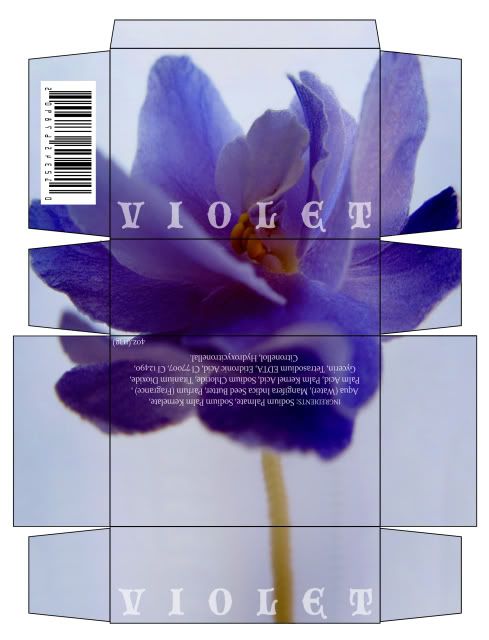
I just wanted to post the flats of my soap box. The photograph is the outside, and the floral print is whats inside.
violet
plz comment on the composition and typefaces.
top panel is the front and so on... and the black strokes
are suppose to represent the size of the fold when the
box is constructed.
top panel is the front and so on... and the black strokes
are suppose to represent the size of the fold when the
box is constructed.


neat stuff
hi guys
i'm designing a magazine for print & web and i've found some nice things to look at in the last few weeks.
http://add-art.org
http://www.good.is
http://www.subtraction.com
cheers.
i'm designing a magazine for print & web and i've found some nice things to look at in the last few weeks.
http://add-art.org
http://www.good.is
http://www.subtraction.com
cheers.
Soap Box Template
hi all.
based on the 'soap vision' description, design soap packaging according to the box template you were given.
you are to make TWO versions of this soap package. bring in both fully cut out and constructed. you may use regular 8.5 x 11 paper.
based on the 'soap vision' description, design soap packaging according to the box template you were given.
you are to make TWO versions of this soap package. bring in both fully cut out and constructed. you may use regular 8.5 x 11 paper.
type too..cute??


sometimes, i dont understand your use of terminology, noah.
anyway, changed the type, moved up the helmets changed kerning, leading of tracklist.


2nd design


for my second design i decided to blow up the title of the album so it really gets in your face. Ive also increased the curning on david bowie. i decided to keep the songs vertical but stacked them next to each other and made them the same texture as the title.
covers


hi guys sorry for the delay.. heres the first of my 2 versions ..any feedback would be appreciated. I tried to use a fond that reflected y albums imageswhilst still retaining the futuristic vibe. My texture for the title is as noah suggested , loud.


Camera Obscura - Let's Get Out Of This Country
Hi Noah & classmates!


This first image is my clever portrayal of the empty, departing emotion by not putting anything under the patterned feathers. I thought it might be interesting.

These are after adding my attempt to draw a bird's head and talons, then the back of the vinyl case in different variations of fonts.
MEAN 26:

Parma:


IM FELL:


(I don't know why it won't enlarge when you click on some of them... and I don't know if it's just my computer or what.)
Give me feedback!
Give me feedback!
Please.
And hope everyone had a great Thanksgiving :)
And hope everyone had a great Thanksgiving :)
new type + need feedback!

Yoo Yoo- i've changed the type a bit but still am working with the same composition that I felt was most successful. I didnt include the track list side because the type takes quite a while to manipulate and create so I wanted feedback beforehand (scroll down to see my original options) I would like specific feedback in regards to...
1. My idea of overlaying the type on an accetate sheet rather than printing it directly on the cardboard.
2. The new typeface versus helvetica
3. How i've created the typeface using similar vector shapes that I used in my colored graphic versus solid type
4. The type composition in general
Commenting is really appreciated- I would like to hold off on moving foreword until I've heard some feedback since my idea is rather time consuming and expensive. Thanks!


hello. hope everyone had a great thanksgiving.

i dont fucking know. please help.

i don't know why the color keeps getting distorted.
Subscribe to:
Comments (Atom)