Your homework this week is simple.
1. For those who attended class, based on critiques revise the most successful of your type specimen wallpapers. Post it here or bring it in to class on thumb drive or printed. Again, your final deliverable is ONE type specimen wallpaper. It is the final part of this project, so make it good. [For those who have not shown me anything yet we need to see all three wallpapers completed.]
2. Choose at least 5 examples of music packaging (vinyl, CD, etc.) that you feel are successful in conveying the feeling or idea of the music. Take specific notes on why they work. Is it use of image? Color? Type? Bring the packaging to class if possible.
See you next week.


Homework, Notes, 10/22/08
hello all
a few of you are still missing work up here. it needs to be posted asap if you want credit for this assignment...
those who missed class wednesday won't have as much background to work off of for your next assignment, but you should be able to accomplish it.
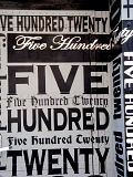
1. using 3 concepts or variations on a concept, create THREE different type specimens that showcase your typeface. the purpose of a type specimen is to give a potential user of the face an idea of it's character, look, and flexibility. therefore the type specimen MUST INCLUDE the following: the name of your face, a short paragraph about it that you will write (where it came from, how it was made, why you named it what it's named, etc.), and every character you've designed.
the size must be 1280 x 1024 pixels, and you can use full color. the type specimen can include, besides the typeface itself, photography, illustration or any kind of imagery that you think complements the face. or it can be just an abstract graphic composition. think of this as a little poster. post your specimen here or bring it in PRINTED on 11x17 paper.
for some examples of type specimens, check out the following links:
http://www.typedifferent.com/2008/goodies/bd_motra_wallpaper.gif
http://www.typedifferent.com/2008/goodies/bd_spacy125_wallpaper.jpg
http://www.typedifferent.com/2008/goodies/bd_broadband_wallpaper.jpg
http://www.typedifferent.com/2008/goodies/bd_viewmaster_neon_wallpaper.jpg
http://www.typedifferent.com/2007/goodies/bd_radiogram_round_wallpaper.gif
http://www.typedifferent.com/2007/goodies/bd_bermuda_wallpaper.gif
http://www.typedifferent.com/2007/goodies/bd_fimo_wallpaper.gif
2. read chapters 3 and 4 of designing with type- they will help you think about how to begin laying out your specimen.
a few of you are still missing work up here. it needs to be posted asap if you want credit for this assignment...
those who missed class wednesday won't have as much background to work off of for your next assignment, but you should be able to accomplish it.
1. using 3 concepts or variations on a concept, create THREE different type specimens that showcase your typeface. the purpose of a type specimen is to give a potential user of the face an idea of it's character, look, and flexibility. therefore the type specimen MUST INCLUDE the following: the name of your face, a short paragraph about it that you will write (where it came from, how it was made, why you named it what it's named, etc.), and every character you've designed.
the size must be 1280 x 1024 pixels, and you can use full color. the type specimen can include, besides the typeface itself, photography, illustration or any kind of imagery that you think complements the face. or it can be just an abstract graphic composition. think of this as a little poster. post your specimen here or bring it in PRINTED on 11x17 paper.
for some examples of type specimens, check out the following links:
http://www.typedifferent.com/2008/goodies/bd_motra_wallpaper.gif
http://www.typedifferent.com/2008/goodies/bd_spacy125_wallpaper.jpg
http://www.typedifferent.com/2008/goodies/bd_broadband_wallpaper.jpg
http://www.typedifferent.com/2008/goodies/bd_viewmaster_neon_wallpaper.jpg
http://www.typedifferent.com/2007/goodies/bd_radiogram_round_wallpaper.gif
http://www.typedifferent.com/2007/goodies/bd_bermuda_wallpaper.gif
http://www.typedifferent.com/2007/goodies/bd_fimo_wallpaper.gif
2. read chapters 3 and 4 of designing with type- they will help you think about how to begin laying out your specimen.


MY FONT ..now with more added characters...

hey guys so ive added numbers and punctuation. Tell me what you think!!!
Class 10/22/08
just making sure you all know that we have class today, wednesday october 22nd. see you there.


 Unfortunately I'm traveling and don't have the ability to scan my final numbers and characters that I was going to show everyone on saturday so I photographed them. I know its a little gray but they are consistent with the designs of my other letter forms. What I did differently since last week was live trace the letterforms and screw applique to look more digital when compared to my hand drawn letters. I played with the tracing options of the screw to keep some of the hand sketched quality but I was unfortunately unable to keep the value of the letterforms once I made them digital letters. My whole file is quite large so I'm posting my A-F jpg so you can see the difference between this week and last week. Let me know what you think and if you'd like me to post my whole hand drawn and digital alphabet. I can post better images on sunday.
Typeface
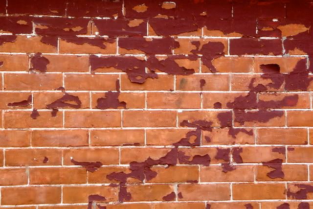
The theme here is letter existing from metal pieces. Like the
I- I showed in class which was a metal piece left behind... I
looked for other metal parts, rusty one, that look like letters.
For those for which I found no metal part I combined pieces, I know
they all look very different from each other- but thats okay.
The point is that its rusty industrial metal parts.
These are just the photographs trimmed and darkened then
live traced. If you view it up close on some you can even see the
original piece and it shape.

noelis.
This Week's Assignment
hi all- sorry about disappearing this past weekend. a dear friend got in some legal trouble and needed emergency help. we didn't get to look at type-specimen examples. so your assignment this week is to finish all the characters of your typeface (incl. numbers and punctuation), and POST IMAGES OF IT HERE so i can look at it from abroad. failure to post images of your completed typeface will equal an incomplete for this assignment.
see you next week,
N
see you next week,
N
Those who showed up for the makeup class


We waited until 11:30 and left because we assumed you weren't coming. Hope everything is alright.
Emergency Cancellation of Make-up Class
hi all
i'm so sorry but due to an emergency i am not able to make it to the make-up class.
i will keep you all posted on what this means for the coming week. if any of you gets this today please call my cellphone at 917 622 1101.
best,
noah
i'm so sorry but due to an emergency i am not able to make it to the make-up class.
i will keep you all posted on what this means for the coming week. if any of you gets this today please call my cellphone at 917 622 1101.
best,
noah
Homework, Notes, 10/8/08, Also: makeup class
small class last this past wednesday... but those who showed are doing a great job.
your assignment:
continue working on your fonts and complete at least one case of the alphabet (upper, lower or mixed case), as well as all the numerals (0-9) and the following punctuation characters:
! ? . , " " ' ' & ( ) @ /
[the quotes and double quotes above are opening and closing quotes- not sure if it's showing in your browsers]
we are meeting in our regular class space on saturday 10/11 at 11am. it will be a shortened class.
see you then.
Reminder + Something Cool
please remember to bring your laptops to class tomorrow.
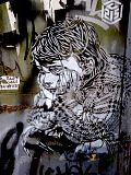
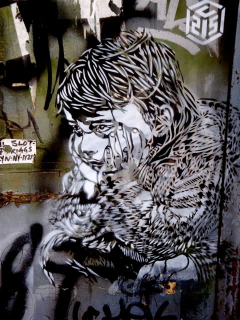
also, check this video out. not necessarily typography, but graffiti for sure.
http://www.youtube.com/watch?v=uuGaqLT-gO4
also, check this video out. not necessarily typography, but graffiti for sure.
http://www.youtube.com/watch?v=uuGaqLT-gO4


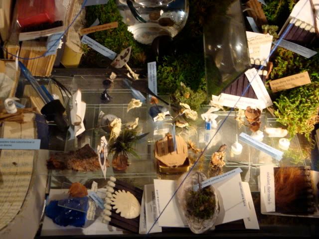
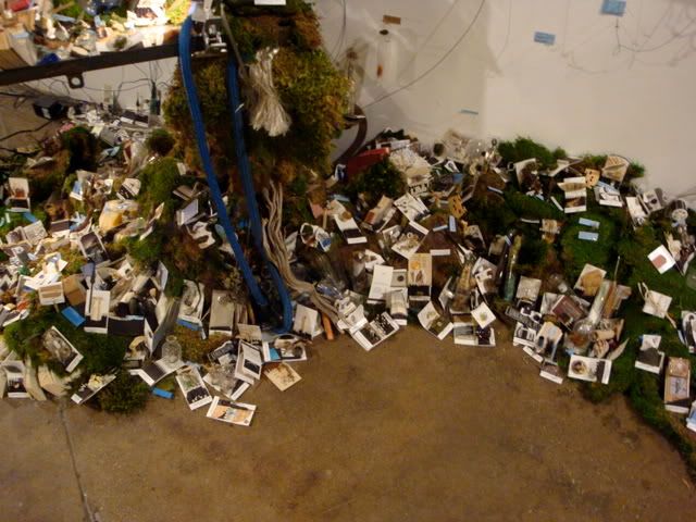
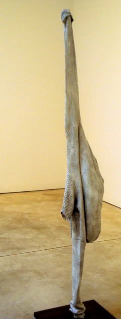
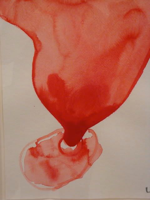
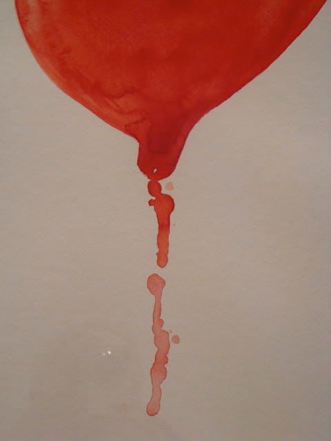
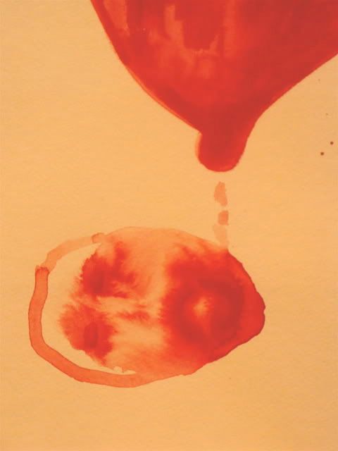
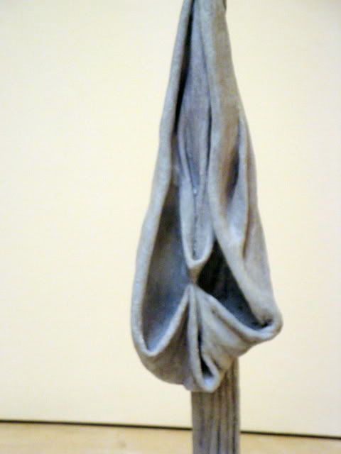
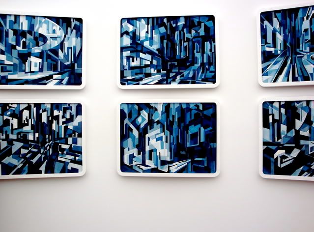
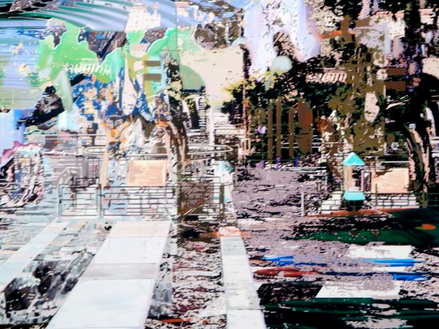
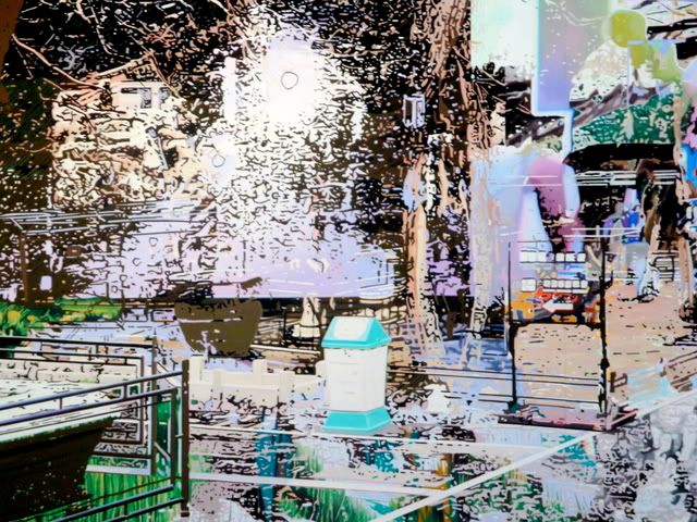
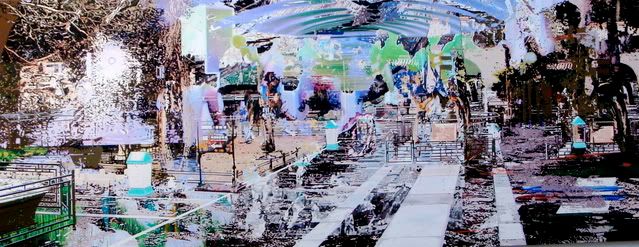
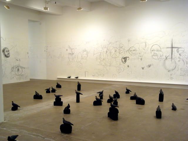
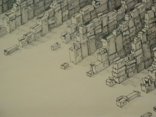
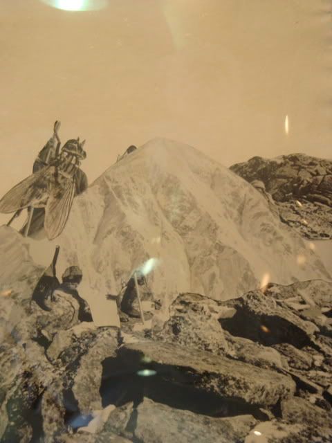
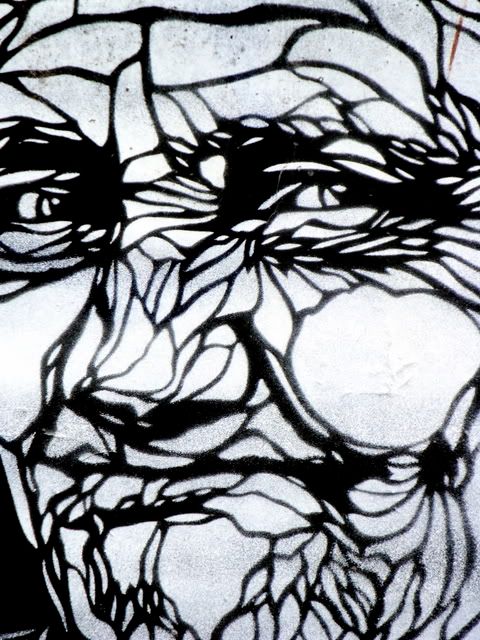
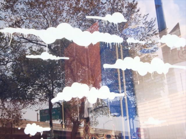
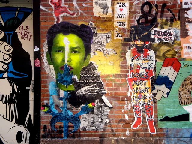
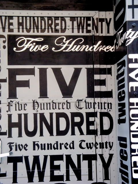
Awesome things are Everywhere
but you shouldn't touch things, because they're not alive.
Heres two days of seeing.
Installation at Third Ward (Gray & Salko)<
Louise Bourgeois Exhibit
( closing soon! go see it. 25th st.)
Chelsea Galleries
Beauty & the Street


Dieu Donne -handmade paper, auction of artist collaborations
madmuseum.org
Heres two days of seeing.
Installation at Third Ward (Gray & Salko)<
Louise Bourgeois Exhibit
( closing soon! go see it. 25th st.)
madmuseum.org
Subscribe to:
Comments (Atom)