
Typeface & Personality
Someone else might be a comm nerd and enjoy this: Do These Serifs Make Me Look Phat? Conveying Personality with Typeface

Tarot Card: Judgment
I went back and tried to revise the placement of the text in the cards, although i did originally plan it to be worded and placed the way it was, but i also wanted to try seeing how it looked based on the comments from class and how the text could work and relate with the visuals like how it does in some of the images i already had. So here they are.
Judgment Tarot Card
Also here is my Tarot Card Icon:

Judgment Tarot Card
Also here is my Tarot Card Icon:
Brooklyn Comics and Graphics Festival
http://www.comicsandgraphicsfest.com/
It's this Saturday and it should be really cool. I went last year and there was tons of beautiful stuff to look at.

It's this Saturday and it should be really cool. I went last year and there was tons of beautiful stuff to look at.

Homework, Notes 11/30/10
Hello all!
Welcome to your final project! You will be using the scene dialogue from the film you chose as the content for a little booklet that you will create. The final booklet (due the final week of class, not next Tues.) will be 4" x 32", with each panel of the booklet being 4" square- e.g. there are 8 panels on each side. See diagram below.
The ONLY pieces of content that can appear in this booklet are:
1. The scene dialogue
2. Optional: The film's title
3. Optional: The names of the characters in the scene
4. Optional: Images of the scene's location (you may NOT use images of the scene's characters)
To begin this project, read your dialogue carefully and begin to think about how to represent the dialogue visually. Consider how:
Then, MAKE THUMBNAIL STORYBOARDS. Please, for all our sakes.
For next week you do not have to assemble the booklet- just bring in your booklet's panels printed out flat. I suggest designing on 11" x 17" paper, as in the diagram. So you would have two 11x17 pages for next week...

Welcome to your final project! You will be using the scene dialogue from the film you chose as the content for a little booklet that you will create. The final booklet (due the final week of class, not next Tues.) will be 4" x 32", with each panel of the booklet being 4" square- e.g. there are 8 panels on each side. See diagram below.
The ONLY pieces of content that can appear in this booklet are:
1. The scene dialogue
2. Optional: The film's title
3. Optional: The names of the characters in the scene
4. Optional: Images of the scene's location (you may NOT use images of the scene's characters)
To begin this project, read your dialogue carefully and begin to think about how to represent the dialogue visually. Consider how:
- Typefaces could represent personalities, ages, genders, accents
- The various fonts/weights in a a typeface could be used for different tones of voice and ways of speaking
- Typeface size could represent volume
- Color could represent emotion or mood
- Space on a page can represent time and pacing in a film
Then, MAKE THUMBNAIL STORYBOARDS. Please, for all our sakes.
For next week you do not have to assemble the booklet- just bring in your booklet's panels printed out flat. I suggest designing on 11" x 17" paper, as in the diagram. So you would have two 11x17 pages for next week...
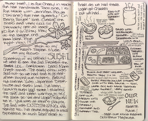
Type n Sushi
So i had the sudden urge for sushi and thought to look up some stuff to put on the blog, and this is what i found!


Fun typeface
I forget where I found this, but I love how these letters, which were inspired by engineering/schematics, have so much personality.


Homework, Notes 11/16/10
Hello boys and girls-
Hope you had a lovely Thanksgiving.
A reminder of what's due for Tuesday:
1. Based on feedback received in class or via email, please revise your Tarot card slideshow. Present in class as PDF or JPG sequence, either laptop or bring on flash drive to be projected. No more blog; viewing in the browser sucks.
2. Pick a movie you love, or think is interesting, and transcribe (or find on the internet) the dialogue of a 3-7 minute scene. I.e. write down the names of the characters and every word they say in that scene. Bring the transcription to class printed (BUT NOT DESIGNED) on a 8.5 x 11 paper.


LOGOTYPES
Some pretty sweet logotypes! Here's the link and my three favorite logotypes
http://www.behance.net/gallery/Logos/789870


http://www.behance.net/gallery/Logos/789870


Homework, Notes 11/9/10
Your assignment this week is to translate the meaning of your Tarot card into a new kind of tarot 'card': a slideshow using type and/or image. You should somehow incorporate into the slideshow some form of the symbols you chose and the story you found.
This is a chance to express yourselves with what you've been learning in this class. Namely, interesting use of form/letterform and composition. Use these tools, as well as pacing, rhythm, color, and framing, to tell your story.
Presentation:
Minimum FOUR slide sequence (no maximum) as 900x600 or 600x900 JPGs, either posted to the blog BEFORE class, or presented as a slideshow on your laptop.
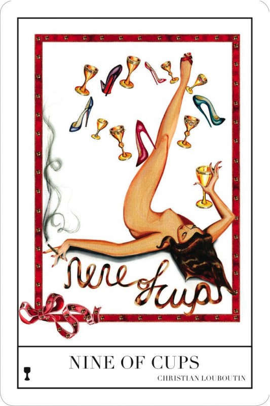
Contemporary Magic: A Tarot Deck Art Project
This exhibit opened last week at the National Arts Club (15 Gramercy Park South). The curator, Stacy Engman, paired 78 different creative icons, from artists to fashion designers, with cards that fit the themes in their work. It's on view for the month of November. You can read more about the exhibit and see more of the cards at these links:
"Fatal Art: Stacy Engman on Her Show of Artist-Designed Tarot Cards" - Artinfo
Artlog
"Fashion? It’s In the Cards" - Fashion Indie


"Fatal Art: Stacy Engman on Her Show of Artist-Designed Tarot Cards" - Artinfo
Artlog
"Fashion? It’s In the Cards" - Fashion Indie


The Typography Manuel for iPod and iTouch
Are you a graphic designer? Do you know the difference between a font and a typeface? Do your eyes light up when conversations turn to ems, kerning, and baseline grids? If you answered yes to these questions, then The Typography Manual for the iPhone and iPod Touch is for you!


NY Art Book Fair: presented by Printed Matter and PS1
I plan on heading to PS1 on Saturday, thought some of you might be interested in this fair as well :)
Proteotypes/Proteus Gowanus is pleased to have a table at
The NY Art Book Fair
presented by Printed Matter at MoMA/P.S.1
This Friday, Saturday and Sunday, November 5-7, 2010
Location: MoMA/P.S.1, Long Island City, Queens,
22-25 Jackson Ave at the intersection of 46th Ave
Come find us at Table Z31 on the second floor.
We will be displaying our books and artifacts and inviting browsers
to practice constrained writing. We will also provide tickets
to a "paradise of reading" through the magic portal of a library card catalog
of art books from the Brooklyn Museum's Libraries and Archives.
Pick one and we will do the rest.
Proteotypes is the publishing arm of Proteus Gowanus.
Proteotypes’ mission is to extend some of what happens at Proteus Gowanus
— themed shows of artwork, satellite exhibits, archival material, events, and workshops —
into the field of printed matter.
This year's theme at Proteus Gowanus is Paradise, of which Jorge Luis Borges,
explorer of imaginary worlds, said, “I have always imagined Paradise as a kind of library.”
www.proteotypes.org
Book Fair Hours: Friday and Saturday, November 5-6, 11am - 7pm
Sunday, November 7, 11am - 5pm
The NY Art Book Fair is FREE and open to the public.
A free bus will operate Saturday, Nov. 6 from 1–5 p.m., providing transport for NY Art Book Fair visitors to Long Island City’s many cultural institutions, including Sculpture Center, Flux Factory, Fisher Landau Center for Art, Socrates Sculpture Park, and Noguchi Museum. Sponsored by the Long Island City Cultural Alliance.
Homework, Notes 11/2/10
Your assignment this week is multi-part:
First, research your assigned Major Arcana tarot card. What does it mean? What are the symbols on it that create that meaning? What is its story? (Wikipedia is a great place to start looking)
1. Find or write a short story (1 paragraph to 1 page) based on the card's meaning. For instance the Chariot card is not about riding a chariot, it's about mastering opposing forces and bringing them to balance. So the story would relate to that idea.
2. Choose 5 symbols that could be used to tell that story visually. They could be abstract or universal (i.e. a heart, a flame) or specific to the particular story you found (i.e. a particular object). Find or create 10 different kinds of images that represent that symbol.
3. Write 20 words that could also be used to represent that card or its story.
Present the symbols, story and words printed out- there can be multiple items on a page.
PLEASE ALSO BRING YOUR LAPTOPS TO CLASS. We are going to use part of the class to work!
Comparing symbols


This blog that I follow compares symbols from two of the best cities in the world New York and Paris. The universal understanding of symbols really shows through even though the simple things that we all relate too everyday are different in both cultures but we can still associate with them both.
http://parisvsnyc.blogspot.com/
Great Posters from Designer Ibraheem Youssef


 This designer makes really great movie posters, among other things. Some of the posters on his site are available for purchase. The posters are really clever and the subtle jokes will make more sense if you have seen the movies.
-Zoe Katleman
Source: www.ibraheemyoussef.com


Street Artist De La Vega
I remember when i was in middle school along 103rd and 5th avenue i would always see these chalk drawings on the sidewalk and they were very random but they always had a message of some kind and it was so weird at the time seeing these chalk drawings down 5th avenue. I thought to find the artist and rememberd his name is De La Vega which he signed along with this chalk drawings. I just thought it was cool and he has his own museum in Soho and has actually gotten in some legal trouble for drawing his messages all over NYC. but check it out!
"James De La Vega is an artist who lives in Soho and works in New York City, Paris, Italy, and Tokyo.He is known primarily for his murals and the chalk drawings he creates on public surfaces such as sidewalks. His murals can be found all over East Harlem, and his chalk drawings may show up anywhere in the city. His street drawings, almost always chalk, are usually accompanied by aphoristic messages such as “Become Your Dream.” Legally, much of his work qualifies as graffiti, although many put them in a separate genre"
De La Vega


"James De La Vega is an artist who lives in Soho and works in New York City, Paris, Italy, and Tokyo.
De La Vega


My9 is just the worst...

Hello there,
This post is going to be an example of what DOESN'T work in design.
I don't about you guys, but I have been getting increasingly annoyed with advertisements for the My9 local tv station on the F train.
... am i right?
Noma Bar: Playing with Negative space & Thinking with typographic


noma-bar/portfolios
Subscribe to:
Posts (Atom)